Tag Archive

tactile graphics

Printing Instructions for TTN Graphics

When you download you Touching The News graphics, you will find a ZIP file containing a PRN and PDF files. How to unzip/uncompress: Windows 10, Windows 8.1, MacOS.

TTN graphics are designed to be printed on ViewPlus Columbia or Delta, or similar: APH PixBlaster, IRIE BrailleTrac / BrailleSheet) and capsule paper (or Swell, PIAF, Zychem). The braille font and raised lines are specific to each embosser or tactile printer. Results may vary if printed on a different embosser.

All files are for 8.5 x 11-inch paper (letter size), landscape or portrait, depending on best fit.

  1. Open PRN in Tiger Viewer or Tiger Designer, available with embosser driver.
  2. Settings are embedded in the file, including paper orientation.
  3. Print (ctrl-P or ctrl-F, depending on printer).
  1. Open the PDF (Adobe recommended). Send to printer. In print settings:
    • Ensure the paper size is 8.5 x 11 (or letter).
    • Check that the paper orientation matches the file (landscape or portrait).
    • Print at 100% or Actual Size. Do not “fit” or “shrink to fit”.
  2. Print.

Back to Touching The News main page

Now we carry tactile drawings of intersections that help teachers and students alike

Now we carry tactile drawings of intersections that help teachers and students alike

By Caitlin O’Malior

LightHouse and the Adaptations Store are proud to introduce the newest independent travel training tool in the Orientation & Mobility (O&M) field, the Tactile Intersection Diagrams Packet. This innovative tool was created through the collaboration of LightHouse O&M instructor Sarah McIntyre and the designers in LightHouse’s Media and Accessible Design Lab.

Sarah explains how these tactile diagrams will help people who are blind or have low vision better understand street intersections and crossings through tactile representation.

“O&M Instructors can use these diagrams to facilitate discussions about intersection design, the movement of vehicles, lane-by-lane scanning patterns, and other topics, such as street crossing recovery while working remotely or indoors. They can also be used as a supplement to onsite instruction and can be used as the platform for any number of innovative remote or indoor lessons for all students.”

When you purchase a packet, you’ll receive 13 different diagrams, including:

  • Intersection shapes
  • 4-way stop sign
  • Basic stoplight
  • Multilane basic stoplight
  • 2 pocket turn lanes
  • 4 pocket turn lanes
  • Dedicated turn lanes
  • 1 one-way street
  • 2 one-way streets
  • T-shaped intersection
  • 4 right-turn islands
  • Pedestrian scramble
  • Roundabout

All materials are printed on 8.5 x 11 Swell paper and have been produced by a PIAF (Pictures in a Flash) machine which raises the carbon in the ink print, creating smooth raised tactile lines and shapes. These new tactile intersection diagrams are an improvement upon previous designs.

“I’ve created other tactile intersection diagrams in the past, embossed in heavy duty foil, but they were very labor-intensive to make, were very bulky with sharp edges, and weren’t adaptable. Creating something that was easily portable, user-friendly, and adaptable was one of my ‘bucket list’ projects. I always had it in the back of my head to find out what it would cost to have MAD Lab design them…when the shelter in place order hit, I figured this was my chance to give it a try,” Sarah says.

The Tactile Intersections Diagrams Packet costs $55. If you are an O&M student, an O&M instructor, or someone who loves tactile literacy and learning more about intersections, this is the ideal product for you.

Order your Tactile Intersections Diagram Packet online today at Adaptations.org or call our store at 1-888-400-8933 between 8:00 a.m. and 5:00 p.m. Pacific, Monday through Friday, with your questions.

P.S. What’s a pedestrian scramble you ask?

A pedestrian scramble is an intersection that stops all vehicles, allowing pedestrians to cross the intersection in all directions, including diagonally.

Who knew? Our O&M Team…obviously…

TMAP Printing Instructions

When you download your TMAP, you will find a ZIP file with a PDF and 4 (or more) SVG files. The SVG files are Tactile Map page, Print Map page, Tactile Legend page(s), Print Legend page(s). The PDF combines these SVGs to print on our embossers. TMAP files are designed to print on ViewPlus embossers, however they can also be printed on capsule paper (or Swell, PIAF, Zychem), or on Index. Results may vary.

TMAP files are intended for 2-in-1 printing, creating an embossed and ink-print document on a ViewPlus (or Tiger) embosser. ViewPlus embossers may incorrectly print braille from PDFs. To mitigate possible braille errors, complete the steps outlined below. This creates an additional PDF with fonts unembedded, filename ending with “_VP”, ready to emboss. (Please note, this step is only for embossing to ViewPlus, and is not necessary for Swell or capsule paper.)

  1. Download the PDF Unembed Fonts tool from the ViewPlus Downloads page (for Windows only).
  2. Run PDF Unembed Fonts (see sections below: with a mouse or in command line)
  3. Open the PDF with _VP in Adobe Acrobat or Reader. Send to printer. In print settings:
    • Check the Tiger tab to optimize results. Printing “draft” quality is not recommended. On ViewPlus Columbia/Delta or APH PixBlaster, Graphics Quality: Best.
    • Check that the paper size matches your TMAP file paper size.
    • Check that the paper orientation matches your embosser output.
  4. Important! If printing tactile-only (NOT using 2-in-1 printing), send odd-numbered pages only (1, 3, etc.).
  5. Print.

Running PDF Unembed Fonts with a Mouse

  1. Create a shortcut to the Unembed program on your desktop.
  2. Drag the PDF on top of the Unembed shortcut icon or browse to the file from the Unembed Fonts tool. This will create a new file with _VP at the end in the original folder.

Running PDFUnembedfonts in Command Line

  1. To ensure the shortest file path, after extracting it is recommended to copy the entire PDFUnembedFonts folder to the root of your C drive (or an external drive). For economy of file path it is further recommended that the PDF also reside in this folder.
  2. From the start menu, Search programs and files, type cmd. Hit Enter.
  3. To point it to the specific directory type cd space c:\pdfunembedfonts
  4. Now to actually run the script on your PDF type pdfunembedfonts space .\filename.pdf. Hit Enter.
  5. If all went well c:\pdfunembedfonts should now contain a version of your PDF, the file name appended with _VP

Though TMAP file can be printed on capsule paper, the braille font is not optimized for this method, and results may vary.

  1. Open the PDF (Adobe recommended). Send to printer. In print settings:
    • Check that the paper size matches your TMAP file paper size.
    • Check that the paper orientation matches your printer output.
    • Print at 100% or Actual Size. Do not “fit” or “shrink to fit”.
  2. Choose braille or large print map:
    • For a map with braille text, send odd-numbered pages only (1, 3, etc.).
    • For a map with large print text, send even-numbered pages only (2, 4, etc.).
  3. Print.

Related Pages: TMAP Main page, Frequently Asked Questions, How to Use TMAP to Make Maps, Reading Tactile Maps, Learn more about TMAP

How to Make a Map Using TMAP

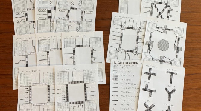
TMAP generates files of tactile street maps, which can be printed with an embosser or on microcapsule paper (either with a PIAF or Swell machine).

TMAP is optimized for Chrome, Firefox, and Safari.

Overview

Steps to producing a tactile street map:

  1. Search an address, intersection, or landmark.
    • If search results are ambiguous, choose between several options or search again.
  2. Create the map. Confirm the map address and choose map settings and features.
  3. Download or email the map file.
  4. Emboss or print the map using a ViewPlus (also called Tiger) embosser or Swellform machine, PIAF, Microcapsule paper. Printing Instructions. Or you can contact Adaptations to print and ship the map.

Step by Step Instructions

1. Search Page, where you search for an address

Starting on the Search Page where it says “Welcome to TMAP”, enter an address, landmark, or intersection into the search bar. This search uses Google maps information, so if Google maps recognizes your search query, TMAP will too. This means you can enter names like “Civic Center BART Station”. You can also enter an address, city, and state, omitting the zip code. You can also enter a street address and zip code only, without city or state. Click the Search button.

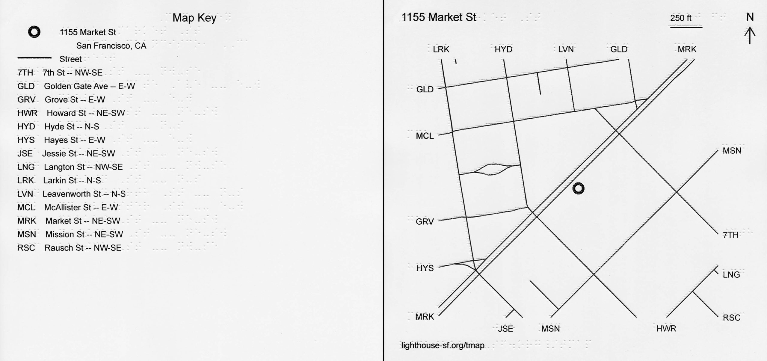
2. Map Preview Page, where you create a map

You should find yourself on a map preview page showing the address, features and settings options, and a visual map preview. If you do not get the result you were hoping for, search for a new address from the search bar or click on the TMAP logo to go back to the main search page.

2a. Map Preview Page: confirm map address

Check that your map is of the correct location. After the search bar reads “Create map for” followed by the address TMAP found from your search. Is this address correct?

If this address is not what you expected or does not match the address you think you searched, check spelling or try omitting apartment numbers. If you enter an address that Google is unsure of, or is ambiguous, like “Main Street”, TMAP will give you a list of options, showing you a preview of maps of various Main Streets in different cities. Select one of the options, if any are correct, or add city name or zip code for better results.

If you want to make a map of this address, you can continue on to choose settings and add features to your map.

2b. Map Preview Page: settings

Once you have confirmed the map address, choose your preferred paper size, map scale, and distance units.

  • Paper size depends on your printer or embosser, and amount of information you want to show on the page.
  • Map scale is how zoomed in or out you want to be, how much information you want to show on the page, or how dense you want the map to be.
  • Distance units is feet or meters.
  • The default settings are 11.5 x 11-inch paper (standard braille paper size), 1:5000 scale (or about ¼ mile on braille paper), and miles.

2c. Map Preview Page: features

Now comes the fun part where you get to add features to the map. You have the option to include streets, paths, service roads, and railways. (Buildings are currently unavailable, but will be back soon.) We have tried to match the look and content of the map preview to the TMAP output, but occasionally you will notice differences, especially around railways that go underground. Some things to know about features:

  • By default, streets are checked.
  • Checking or unchecking these buttons will not change the map preview.
  • On the map preview, the thicker solid lines are streets, thinner solid lines are service roads, dotted red lines are paths, and dashed lines are railways.
  • All of the data we use to generate map is from OpenStreetMap, an editable, opensource map of the world created by volunteer mapmakers. If someone has not yet mapped the path by your house, it will not show up on TMAP. If you notice something important missing (like your favorite walking trail), please contact us and we will try to add it in to OpenStreetMap.
  • We do not recommend checking all the boxes for every map. Though this may be tempting, it will create a very cluttered and potentially illegible reading experience.
  • For zoomed in map, it’s ok to include paths, service roads, and railways.
  • Service roads are things like alleys, bus lanes, and main routes through parking lots (we have omitted smaller parking lot aisles to eliminate clutter). If these are significant to the reading of your map, then include them. If not, it’s best to omit them.
  • We recommend caution when selecting railways and paths on maps covering large areas since they can blend in and overlap too much with streets, but the density of your map varies based on location, so experiment and play around with it.

2d. Map Preview: pan

By default, the address you searched is in the center of the map preview box. If using a mouse, you can pan to the area you want to print by clicking, holding, and moving any part of the map. If you drag your address outside of the map preview, the center locator dot will no longer appear on your printed map, though the map will still be titled with your searched address.

2e. Map Preview: zoom

If you change map scale from the dropdown above the map, the preview automatically zooms in or out. You can also click on the plus and minus buttons at the top right corner of the map preview.

2f. Create Map

Once you have chosen a paper size, map scale, distance units, and map features, click the Create Map button. This will bring you to the File Preview page where you can download or email the map file.

3. File Preview and Download

On the File Preview and Download page, you have another chance to confirm your map choices. This page reads “Download map for” and lists the address TMAP found from your search. There is also a visual preview of the generated file, showing the print version of the map with streets, street name abbreviations, and any features you selected that appear on the map.

If you aren’t happy with the file preview, you can navigate back to the previous page to edit your selections. If you click the back button on your browser, all settings except map features will be saved (except on Safari, you lucky mapmaker).

If you are happy with the file preview, you can click Download or Email. Emailing the file simply sends the TMAP files to the email address you’ve entered. It will come from tmaps@lighthouse-sf.info When you download your TMAP, you will find a ZIP file containing a PDF and 4 (or more) SVG files. The SVG files are Tactile Map page, Print Map page, Tactile Legend page(s), Print Legend page(s). The PDF combines these SVGs to print on our embossers.

4. Print or Emboss

Now print your map! See Printing Instructions

Having trouble? Check our Frequently Asked Questions or contact us. Check out our recent presentation (demonstration at 17:55).

Order TMAPs from Adaptations.org

Related Pages: TMAP main pageHow to Use TMAP to Make Maps, Reading Tactile Maps, Download Introduction to TMAP page, Learn more about TMAP

About TMAP

How can someone without eyesight learn a city block or navigate a new neighborhood? In 2018, the LightHouse of the Blind and Visually Impaired – SF introduced TMAP: Tactile Maps Automated Production, offering on-demand tactile street maps.

Covering an area of several blocks surrounding a given address, TMAP uses both braille and large print to identify streets, represented by crisp, raised lines that can be easily followed with the fingertips.

TMAP is a collaboration of the LightHouse for the Blind and Visually Impaired, and the Smith-Kettlewell Eye Research Institute.

Side by side key and tactile map of 1155 Market Street showing braille and print text, tactile and ink street lines.
TMAP of the LightHouse Building location in San Francisco, CA.

Order a map for $26.25

To order a map, call our product specialists at 1-888-400-8933 or or visit adaptations.org and specify the street address of the map you’re interested in receiving. Within two business days we’ll ship you your map.

What’s in the package?

  • You will receive two maps of the same address, a zoomed-out overview map, and a zoomed-in detail map showing streets, paths, and buildings, if the data is available
  • A tactile map key
  • An introductory page (download intro page)
  • All materials are printed on 11” X 11.5” sheets of embossed paper and include ink / large print labels in addition to braille

Learn more about the MAD Lab where these maps are produced.

Contact

Recent Presentations: At Home With APH: TMAP – Building Environmental Literacy at a DistanceMobility Matters 2020 Slides, Mobility Matters 2020 Video Presentation

Related Blog Posts: Maps, at your Fingertips, New local tactile maps at Adaptations

Love maps? Sign up for our newsletter!


Reading Tactile Maps

Lesson Plans

Learning to read a tactile map can be a challenge. LightHouse O&M instructor Sarah McIntyre has put together two lesson plans to help students get acquainted with TMAPs.

Download Sarah’s Lesson Plans: Reading a TMAP and Using a TMAP While Exploring.

Other Resources

Teaching Tactile Graphics (Lucia Hasty for Perkins)

Related Posts: Putting the Mobile in Mobility

Related Pages: Frequently Asked Questions, How to Use TMAP to Make Maps, Reading Tactile Maps, Learn more about TMAP

LightHouse’s MAD Lab designs tactile comic strips for the Charles M. Schulz Museum

LightHouse’s MAD Lab designs tactile comic strips for the Charles M. Schulz Museum

Charlie Brown and Snoopy are some of the most well-known characters of all time. By the time Peanuts’ creator Charles Schulz retired in December 1999, the comic strip had run for 50 years and been syndicated in over 2,600 newspapers worldwide, with book collections translated into more than 25 languages.

Peanuts is universally human in its sarcastic, nostalgic, bittersweet, silly, realist and occasionally fanciful humor. Schulz filtered his own dark irreverence into the trials and tribulations of Charlie Brown, Snoopy, Linus, Lucy, and the rest of the characters many of us came to know and love. It is, fundamentally, a story of a dream not quite achieved — and how, even so, another day will come to pass.

A view of the Charles M. Schulz museum lobby.

It’s for its universality and renown that the Charles M. Schulz Museum in Santa Rosa remains dedicated to making Peanuts accessible to all — including the blind and low vision community. Just this month, the LightHouse MAD Lab worked with the Schulz Museum to create a tactile representation of a four-panel Peanuts strip first published on July 31, 1951.

The museum’s School and Youth Programs Coordinator Monica Hernandez initiated the collaboration after learning more about museum accessibility while studying at SF State, and to prepare for the museum’s second Accessible Tours Day, which will be held on September 23, 2018.

“As I understand it, often people with disabilities are told that they’re too expensive, that it’s too much trouble or effort to take on a project like this,” says Hernandez. “That’s not what we’re about. We try to do our best with accessibility at the museum.”

“The comic strip and Peanuts in general are such an accessible and universal topic,” she continues. “People from all over the world love and know and understand Snoopy. Schulz put a little bit of himself into every character, and we all relate to at least one of them — whether it’s the innocent and gullible Charlie Brown or Peppermint Patty because she’s good at sports.”

The strip in question was chosen deliberately in hopes of demonstrating the evolution of the (arguably) most beloved characters — Charlie Brown and Snoopy. An earlier depiction, the strip shows Snoopy running on all four legs (he later evolved to his more recognizable upright, two-legged stance) and a youthful, oblong-headed Charlie (into the 90s, his neck and torso elongated and he adopted a wobbly, anxious mouth).

Charlie Brown challenges Snoopy to a race: “Snoopy, let’s have a race!” When Snoopy sets off, Charlie Brown stays put: “Ah, now I can eat this candy in peace!”

It’s a sweet a simple strip that offers some insight into the very beginnings of the Peanuts’ long and storied history and evolution. MAD Lab’s 10″ X 11″ Direct UV prints used the simplicity of Schulz’s bold lines to their advantage — one set of the ensuing tactile representations feature one-to-one raised lines and braille descriptions. A second set used used various fills, textures and relief heights to differentiate between the overlapping figures of Charlie Brown and Snoopy.

MAD Lab’s Senior Designer Naomi Rosenberg found the project to be a great exercise in translation: “We’re trying to stay as true to the original comic strip as possible, but translate it in a way that makes sense to the touch,” she says. “Pairing tactiles with succinct descriptions provided by the museum was a great approach. They really had the right intentions and a good understanding of the needs of blind users. There’s something exciting about working with a museum that sees a lot of kids and school groups coming through. The project might have an impact on exposing kids to tactiles early on.”

Hernandez was very happy with the project’s outcome and looks forward to seeing how the community receives the strip during Accessible Tours Day.

“It was so great working with the MAD Lab on this project and learning from their expertise,” says Hernandez. “They were very positive and warm throughout the process and openly offered suggestions. The project will go a long way for increasing the Museum’s accessibility and starting further conversations and projects around access.”

Accessibility at the Charles M. Schulz Museum

Schulz himself initiated accessible projects including a braille version of “Happiness is a Warm Puppy”, which can be viewed at the museum upon request.

MAD Lab’s tactile comic strip is also on view by request and will be available for viewing the museum’s Accessible Tours Day on Sunday, September 23 from 10 a.m. to 1 p.m. Special tours will be available for deaf, hard of hearing and low vision visitors led by trained docents with sign-language interpreters throughout the morning.

To reserve your tour time in advance call 707-284-1263 or email monica@schulzmuseum.org. Tours are included with regular museum admission and the museum also offers large-print booklets of exhibition text at the front desk for low vision visitors.

Contact the MAD Lab

To contract for custom tactile maps of your neighborhood, workplace or university or propose a museum project like this one, visit https://lighthouse-sf.org/braille-and-accessible-design/.

Ten things to know about tactile graphics

Ten things to know about tactile graphics

Here at the LightHouse, we’re determined to be at the forefront of tactile innovation, education and literacy. Thanks to the work of our Media and Accessible Design Lab (MAD Lab), we’re constantly generating new methods of conveying visual information in accessible and thoughtful ways, and working with organizations all over the world as consultants and educators. Just this month, we presented during San Francisco Design Week to a group of more than 40 designers from various industries about the value of tactile literacy. The follow tips are a great starter kit to understand the importance of accessible print design and way to approach its design:

Tactile graphics convey non-textual information to people who are blind or have low vision. These may include tactile representations of pictures, maps, graphs, diagrams and other images. A person who is blind can feel these raised lines and surfaces in order to obtain the same information that people who are sighted get through looking at pictures or other visual images.

  1. Developmentally, touch begins at birth whether sighted, visually impaired, or blind. Even sighted infants have low vision, so tactile stimuli is a huge part of early development.
  2. Tactile Graphics are vital to inclusion in education, employment, transit, and many other areas. As a highly visual society, we often convey useful and educational information visually. People who don’t have access to visual cues because of blindness get excluded from educational, practical and recreational information. It’s crucial to provide children accessible versions of visual information at the same time as their sighted peers.
  3. To interpret and understand a tactile graphic, the reader must have some experience with the object or concept being pictured. Background information and context are key. Take a map of a bus stop as an example — to interpret it you’d need to know enough about buses to know that they travel along streets. Building on an existing knowledge of a space or topic, a key identifies symbols or labels. Symbols and braille abbreviations are crucial when designing a tactile graphics, because they simplify information and make landmarks easy to identify and differentiate.
  4. Build on students’ own experiential knowledge and concrete understanding. Beginner tactile learners benefit from exposure to maps of a place they know well, like their bedroom, so they can make connections between their mental map and the physical space that the map represents. If you know it’s ten feet to the door from your bed, you’ll have a better sense of the relationship between the bed to door when observing a tactile representation.
  5. The key word of tactile graphics is simplify, simplify, simplify! When designing a tactile map, we always identify the most essential parts of the information being conveyed. We ask, “What are the essentials of moving through this space?” On a TMAP (the simplest of our maps) we don’t include buildings because they create clutter, and make the maps harder to decipher.
  6. There is more to making a graphic tactile than raising lines and adding braille labels. You can’t just raise the lines on a map as is — you have to leave white space, room for braille labels, create space, find the essentials, make sure the relationships between points of interest are preserved, and select the most important points to include. Again, simplify! Our maps may not be to scale, but we’re sure to preserve the necessary relationships between landmarks.
  7. Not everything that appears as a visual graphic needs to be a tactile graphic. Sometimes a picture is worth a thousand words, and sometimes the words are worth the words. Ask yourself, “What is the most useful way of conveying information?” Sometimes a sentence or a 3D object representation would be a more effective means of communicating information. It depends on the audience, their skill-level and what you’re trying to convey. If an object is too small, too large, too dangerous, then make a tactile graphic — but if you’re trying to show someone what a pine cone is, then bring them a pine cone.
  8. Reading and understanding tactile graphics is not as easy as it may look; do everything you can to make it easier. Reading tactile graphics is not an inborn skill, it’s a skill that needs to practiced. You can run your hands across lines and get nothing out of it if you haven’t been taught how to interpret that information. Tactile literacy comes with education, simplification and builds on existing knowledge. It’s not easy — but with some research designers and educators can make it easier on blind and low vision students.
  9. With good tactile graphics, great results are possible. With a good tactile graphic, a blind person can lead a sighted person around a space!
  10.  There are resources available! You don’t have to do this alone.

To learn more about tactile graphics, get in touch with the LightHouse Media and Accessible Design Laboratory (MAD Lab).

The LightHouse MAD Lab is comprised of a team of designers and consultants specializing in braille, tactile maps, accessible venues and alternative media of many formats. They’ll help you go beyond baseline ADA compliance to contextualize and innovate within the scope of your project.