
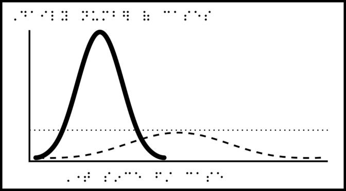
Title: Flattening the Curve.
Description: Graph with three lines, x-axis label: Time since first case, y-axis label: Daily number of cases. The first line is a tall curve labeled “Cases without protective measures,” starts at the origin with its peak high on the y-axis. The second line is a short curve labeled “Cases with protective measures,” starts at the origin, with its peak about 25% height of the first line and further to the right (more time since first case), the top just reaches the third line. The third line labeled “Capacity of the healthcare system” is straight and horizontal at the lower portion of the graph, about 25% up from the origin.
Source: Flattening the Coronavirus Curve, The New York Times,
ZIP folder contains files for producing tactile graphics on 8.5 x 11-inch paper, landscape:
- PRNs for ViewPlus Columbia / Delta, APH PixBlaster, IRIE BrailleTrac / BrailleSheet;
- PDFs for Swell, Microcapsule or PIAF;
- Reference PDFs with corresponding large print text (not for tactile production).
Printing Instructions and Supported Embossers
How to unzip/uncompress: Windows 10, Windows 8.1, MacOS.
Submit Your Ideas and Touch The News
Sign up
Sign up to receive tactile graphics files to print at home.