
Here at the LightHouse, we’re determined to be at the forefront of tactile innovation, education and literacy. Thanks to the work of our Media and Accessible Design Lab (MAD Lab), we’re constantly generating new methods of conveying visual information in accessible and thoughtful ways, and working with organizations all over the world as consultants and educators. Just this month, we presented during San Francisco Design Week to a group of more than 40 designers from various industries about the value of tactile literacy. The follow tips are a great starter kit to understand the importance of accessible print design and way to approach its design:
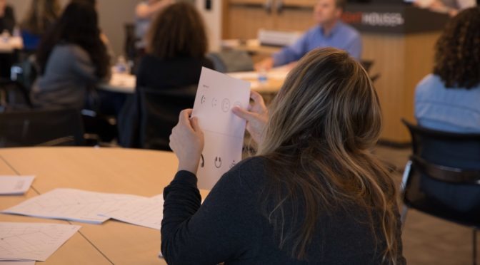
Tactile graphics convey non-textual information to people who are blind or have low vision. These may include tactile representations of pictures, maps, graphs, diagrams and other images. A person who is blind can feel these raised lines and surfaces in order to obtain the same information that people who are sighted get through looking at pictures or other visual images.
- Developmentally, touch begins at birth whether sighted, visually impaired, or blind. Even sighted infants have low vision, so tactile stimuli is a huge part of early development.
- Tactile Graphics are vital to inclusion in education, employment, transit, and many other areas. As a highly visual society, we often convey useful and educational information visually. People who don’t have access to visual cues because of blindness get excluded from educational, practical and recreational information. It’s crucial to provide children accessible versions of visual information at the same time as their sighted peers.
- To interpret and understand a tactile graphic, the reader must have some experience with the object or concept being pictured. Background information and context are key. Take a map of a bus stop as an example — to interpret it you’d need to know enough about buses to know that they travel along streets. Building on an existing knowledge of a space or topic, a key identifies symbols or labels. Symbols and braille abbreviations are crucial when designing a tactile graphics, because they simplify information and make landmarks easy to identify and differentiate.
- Build on students’ own experiential knowledge and concrete understanding. Beginner tactile learners benefit from exposure to maps of a place they know well, like their bedroom, so they can make connections between their mental map and the physical space that the map represents. If you know it’s ten feet to the door from your bed, you’ll have a better sense of the relationship between the bed to door when observing a tactile representation.
- The key word of tactile graphics is simplify, simplify, simplify! When designing a tactile map, we always identify the most essential parts of the information being conveyed. We ask, “What are the essentials of moving through this space?” On a TMAP (the simplest of our maps) we don’t include buildings because they create clutter, and make the maps harder to decipher.
- There is more to making a graphic tactile than raising lines and adding braille labels. You can’t just raise the lines on a map as is — you have to leave white space, room for braille labels, create space, find the essentials, make sure the relationships between points of interest are preserved, and select the most important points to include. Again, simplify! Our maps may not be to scale, but we’re sure to preserve the necessary relationships between landmarks.
- Not everything that appears as a visual graphic needs to be a tactile graphic. Sometimes a picture is worth a thousand words, and sometimes the words are worth the words. Ask yourself, “What is the most useful way of conveying information?” Sometimes a sentence or a 3D object representation would be a more effective means of communicating information. It depends on the audience, their skill-level and what you’re trying to convey. If an object is too small, too large, too dangerous, then make a tactile graphic — but if you’re trying to show someone what a pine cone is, then bring them a pine cone.
- Reading and understanding tactile graphics is not as easy as it may look; do everything you can to make it easier. Reading tactile graphics is not an inborn skill, it’s a skill that needs to practiced. You can run your hands across lines and get nothing out of it if you haven’t been taught how to interpret that information. Tactile literacy comes with education, simplification and builds on existing knowledge. It’s not easy — but with some research designers and educators can make it easier on blind and low vision students.
- With good tactile graphics, great results are possible. With a good tactile graphic, a blind person can lead a sighted person around a space!
- There are resources available! You don’t have to do this alone.
To learn more about tactile graphics, get in touch with the LightHouse Media and Accessible Design Laboratory (MAD Lab).
The LightHouse MAD Lab is comprised of a team of designers and consultants specializing in braille, tactile maps, accessible venues and alternative media of many formats. They’ll help you go beyond baseline ADA compliance to contextualize and innovate within the scope of your project.
Happy 4 July! Twitter said that they’d be a starter kit and so I thought maybe it would be a link to receiving some tactile 🙂